everyone who creates anything has a creative process---meaning, a way in which they arrive to the finished project from the start point. my creative process differs depending on what is inspiring me at the moment or if i'm creating a layout for an assignment versus just creating for myself. assignment work is primarly product driven, so naturally the photos i use would have to be inspired by the products i'm assigned. but, when i scrap something for myself (which is rare these days) i almost always start with a story i want to document or a photo that needs to shine.
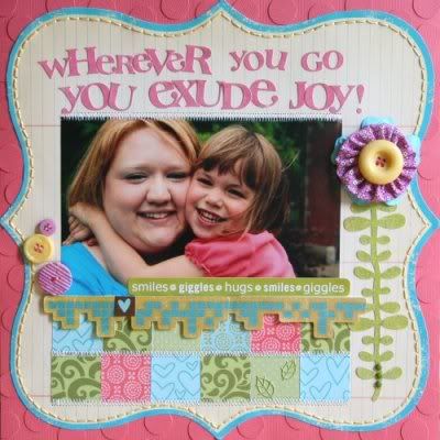
as a bonus........i've got a full tutorial to post showing you my creative process for this layout, from start to finish! enjoy!
1. The way I start my layouts is different every time.
- Sometimes I’m completely inspired by a collection of papers together and then pull a photo that works.
- Sometimes it’s the story that needs told and telling it might take up a lot of journaling space, so product and picture size will dictate what I choose.
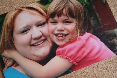
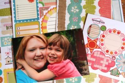
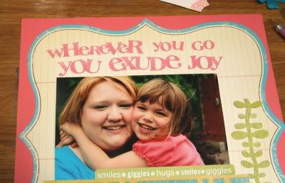
- Sometimes it’s simply the photo that I want to shine so I start there, then find products that blend. That’s exactly what I did for this layout.
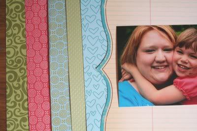
2. Next, I choose patterned papers. You can guarantee:
- I always have neutral patterned paper or cardstock as my background
- I always choose 3 colors right from the picture
- I always choose a bold pattern, a few medium patterns, and a paper with TEXTURE
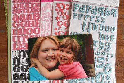
3. Next, I move to my alphabet collection and pull anything that I think will coordinate with the papers & photo. I’ll decide on which one specifically once I get the photo and paper design figured out in my head. During this whole process I usually don’t have any idea of what I want the final page to look like. I’m more of a push it around the page until it looks good person, instead of following a sketch.
4. Next, I move to my sticker collection and pull anything that has the same color scheme going on. Again, I absolutely will NOT use all of these, but again, I won’t know until I start putting the page together.
5. Next, I’m ready to get started. Since the photo, title and journaling take up most of the space on layouts, that’s what I start with when beginning my page. More often than not, I choose a title that *is* my journaling. Titles feel awkward to me, so I go back and forth between lengthy journaling and title/journaling.
6. I’ve decided on title journaling for this one because my printer is out of ink. HA! So the title is “Wherever you go, YOU EXUDE JOY!” A couple things......
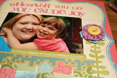
- This long title now dictates which stickers I use because there has to be enough to do the whole title.
- Also, because the size/spacing of the stickers needs to fit.
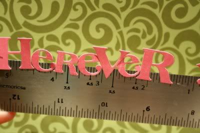
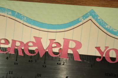
- To help with spacing, I stick my alphabets onto a Making Memories metal ruler halfway, then I can adjust spacing without ripping up the stickers and ruining my patterned paper.
7. Placement of the title is SO much easier when using a ruler as a tool. You can easily lay the ruler down and let the top half of the stickers transfer to your paper, then bend at a slight angle to pull away so that the lower half of your stickers release from the ruler. Use your finger to adhere them the rest of the way.
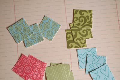
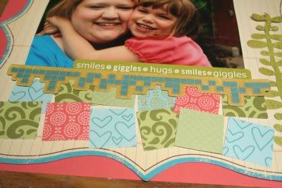
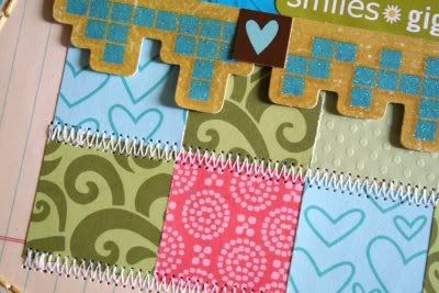
8. So, as I’m going through the process of photo/title placement, I decided that I want the patterned paper to resemble a cozy, quilt-like feel because of the feeling the photo relays. Simple enough, I just grab my square punch and start punching.
9. Then, I just start laying papers/embellishments down and push them around the page until I’m happy with the placement. At this point...
- I still haven’t adhered my photo.
- You’ll also notice that my background cardstock changed. I wasn’t quite thrilled with the lighter green. It might change again, I haven’t decided at this point.
- The only thing that is for sure stuck is the green sticker strip at the bottom of the photo and the title/journaling.
10. Next, I start thinking about embellishments.
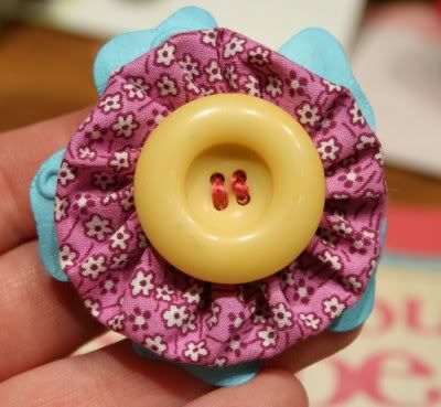
- I almost always have something handmade on my page
- Always something with texture.
- Always something dimensional.
11. Now is where I push everything around the page until I have the placement I like. Then I can start to adhere everything. At this point.....
- I’m always looking for ways to add texture & dimension.
- So, I look for ways to do so. 3-D foam tape is my friend.
- I’m also addicted to embroidery floss and hand stitching, so I’m thinking about ways to add it in.
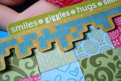
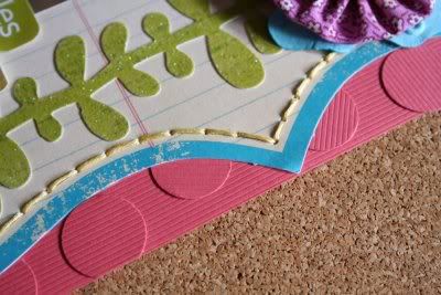
12. So, I’ve decided that popping up the glittered border with foam tape was the perfect way to add some dimension. But not enough....
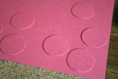
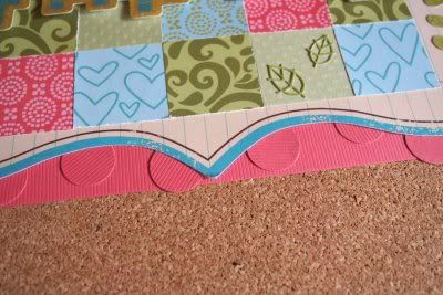
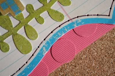
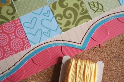
13. So, I then resorted to my other favorite way to add some ummpf to my layouts--tone on tone dimension. I just punch circles using my ¾” circle punch with the same color of cardstock and then adhere in a random pattern. I knew my background die-cut paper would cover most of the background so I just added this tone on tone around the outer edges of my cardstock.
14. So, title is on, photo is adhered, papers are adhered along with one handmade flower embellishment. Dimension is achieved. Now, I want a little more texture and I’m still looking for a way to add in some stitching. Well, lookie there......that thin brown border all the way around the inside of my die-cut paper is just screaming for some attention.
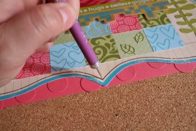
15. So, I prepare to stitch ‘er up.
- I always use my paper-piercing tool (or a pushpin if it’s lost).
- I always pierce the definite points first
- I never measure, just eyeball the distance between, piercing holes approximately ¼” apart.
16. Once you’re done it will look something like this
17. Then, I often will set aside my project and stitch it while doing some other mindless activity like supervising kids' computer time, watching a movie, or waiting at the doctor.
- Use 6-strand embroidery floss.
- Do it in sections, don’t try to cut your floss long enough to go around the entire page.
- If you get a knot, cut and tie it off and start with new floss.
- Taping the ends is so much easier than knotting.
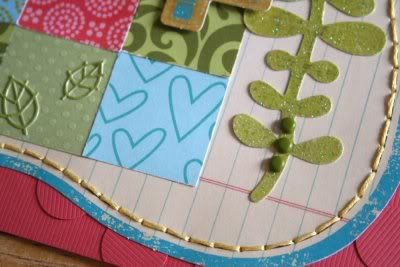
18. Isn’t the texture and dimension lovely? I think it’s irresistible.
19. All that leaves is a few finishing touches that I like to add.
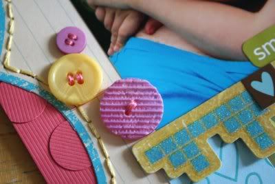
- I always seem to work in a button or two.
- And add small subtle sticker embellishments, like the tone on tone leaves and the brown square with a teal heart.
- Or jazz something up with some subtle brad placement, like on the bottom of the stem.
- And sometimes the page just begs for some zig-zag stitching, but only if my sewing machine is always out and threaded.
And there you have it! A peek into my creative process.


Thanks for sharing! I love the tone on tone cardstock trick--never done that but will try it for sure!
ReplyDeletewow that's fantastic.. thanks so much for sharing your process
ReplyDeleteWow! Thanks for sharing your process. I love the way your layout turned out.
ReplyDeleteHi, I've seen a lot of people do this - and I love having a peek into their creative process - but the way you presented yours is the best I've seen. I love the bullet points and all the photos and the end product. A GREAT post, thanks!
ReplyDeleteThanks! Fun page. Love the colors.
ReplyDeleteI adore this page - really, really cute. I've just begun to get into texture - I've resisted for a long time, so I love your tips.
ReplyDeleteOne question though - do you have a problem putting a page like this into an album? I'm always afraid that the pages are going to be too thick and warp the other pages in the book. Do you have this issue?