anywho.
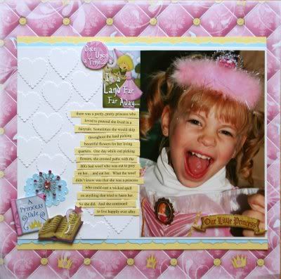
here's a few more samples using the Princess collection......
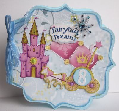
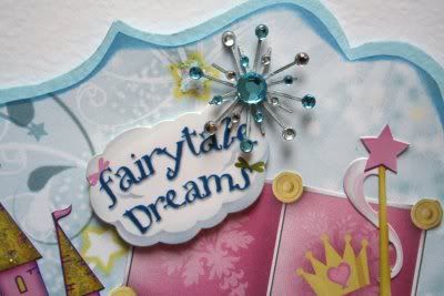
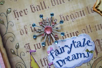
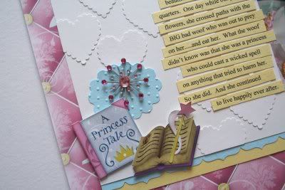
closeup of my favorite embellishment right now....the starburst brads!
inside view...
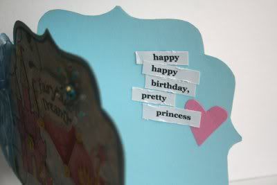
photo on this one was taken by my sweet friend Nena back when i visited her (October 07)
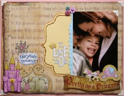
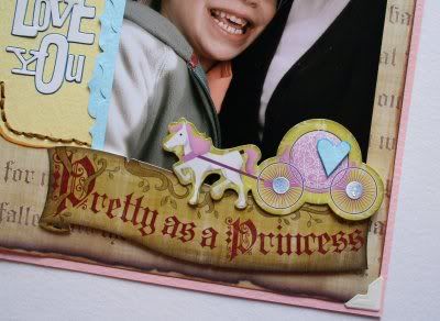
i wanted to make this storybook paper look like it really came right out of a pop-up storybook, so i altered i with ink and glitter and made the stickers dimensional.
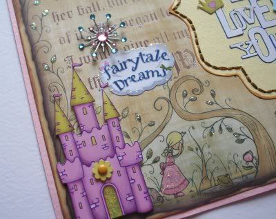
of course i couldn't resist some stitching....and layering of the border punched cardstock.
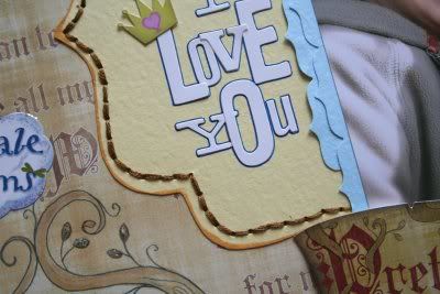
and on this one.....same layering technique with tone on tone cardstock, just using a Fiskars squeeze punch instead of a circle punch.


No comments:
Post a Comment
thank you for taking time to connect with me in this space! i will do my best to leave comments answering any questions you may ask. if you are commenting on an older post and you dont see your comment publish right away it is because I have comments set to be approved before publishing on any blog posts older than 10 days old due to a recent influx of comment spammers. i will see your comment, approve it and reply to you....if it isnt spam. xoxo :)